ggplot
A R language ggplot2 package liked grammar of graphics library for R# language programming.
The R# language is another scientific computing language which is designed for .NET runtime, R# is evolved from the R language. There is a famous graphics library called ggplot2 in R language, so keeps the same, there is a graphics library called ggplot was developed for R# language.
usage
require(ggplot);

const volcano    = read.csv(`${@dir}/log2FC.csv`);
const foldchange = 1.5;

# create color factor for scatter points
volcano[, "factor"]  = ifelse(volcano[, "log2FC"] >  log2(foldchange), "Up", "Not Sig");
volcano[, "factor"]  = ifelse(volcano[, "log2FC"] < -log2(foldchange), "Down", volcano[, "factor"]);
volcano[, "factor"]  = ifelse(volcano[, "p.value"] < 0.05, volcano[, "factor"], "Not Sig");

# transform of the pvalue scale
volcano[, "p.value"] = -log10(volcano[, "p.value"]);

print("peeks of the raw data:");
print(head(volcano));
print("count of the factors:");
print(`Up:      ${sum("Up"      == volcano[, "factor"])}`);
print(`Not Sig: ${sum("Not Sig" == volcano[, "factor"])}`);
print(`Down:    ${sum("Down"    == volcano[, "factor"])}`);

# [1] "peeks of the raw data:"
#         ID        p.value   log2FC    factor
# <mode>  <string>  <double>  <double>  <string>
# [1, ]   "Q5XJ10"   9.81     -0.205    "Not Sig"
# [2, ]   "A8WG05"   5.21      0.0472   "Not Sig"
# [3, ]   "Q8JH71"   11.6     -0.38     "Not Sig"
# [4, ]   "Q7T3L3"   8.85      0.165    "Not Sig"
# [5, ]   "Q567C8"   21        0.837    "Up"
# [6, ]   "Q92005"   0.091    -0.00514  "Not Sig"
#
# [1] "count of the factors:"
# [1]     "Up:      90"
# [1]     "Not Sig: 2643"
# [1]     "Down:    93"

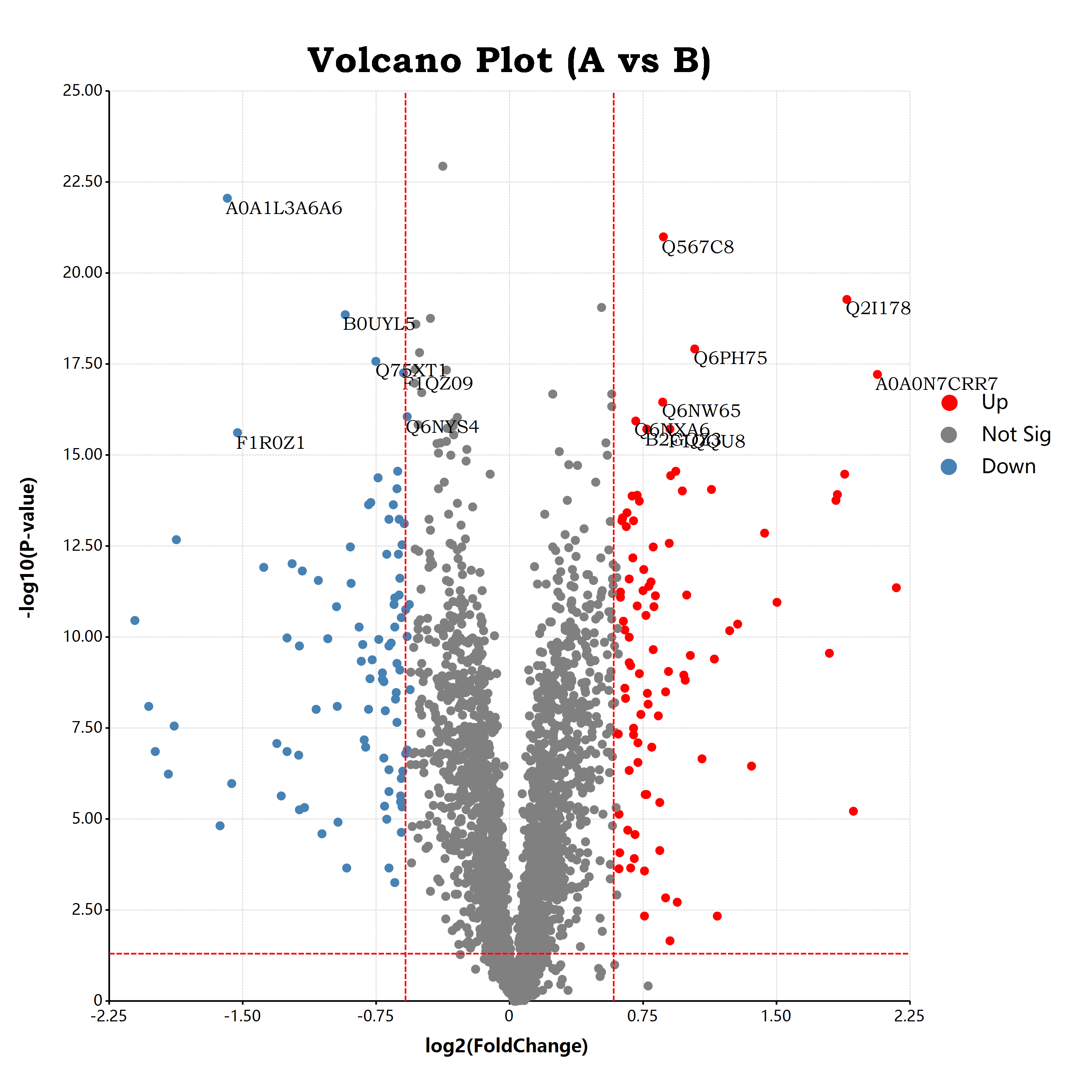
bitmap(file = `${@dir}/volcano.png`, size = [3000, 3000]) {

   # create ggplot layers and tweaks via ggplot style options
	ggplot(volcano, aes(x = "log2FC", y = "p.value"), padding = "padding:250px 500px 250px 300px;")
	    + geom_point(aes(color = "factor"), color = "black", shape = "circle", size = 25)
       + scale_colour_manual(values = list(
          Up        = "red",
          "Not Sig" = "gray",
          Down      = "steelblue"
       ))
       + geom_text(aes(label = "ID"), which = ~(factor != "Not Sig") && (p.value >= 15) )
       + geom_hline(yintercept = -log10(0.05),      color = "red", line.width = 5, linetype = "dash")
       + geom_vline(xintercept =  log2(foldchange), color = "red", line.width = 5, linetype = "dash")
       + geom_vline(xintercept = -log2(foldchange), color = "red", line.width = 5, linetype = "dash")
       + labs(x = "log2(FoldChange)", y = "-log10(P-value)")
       + ggtitle("Volcano Plot (A vs B)")
       + scale_x_continuous(labels = "F2")
       + scale_y_continuous(labels = "F2")
	;
}
Use ggplot as python module
import ggplot

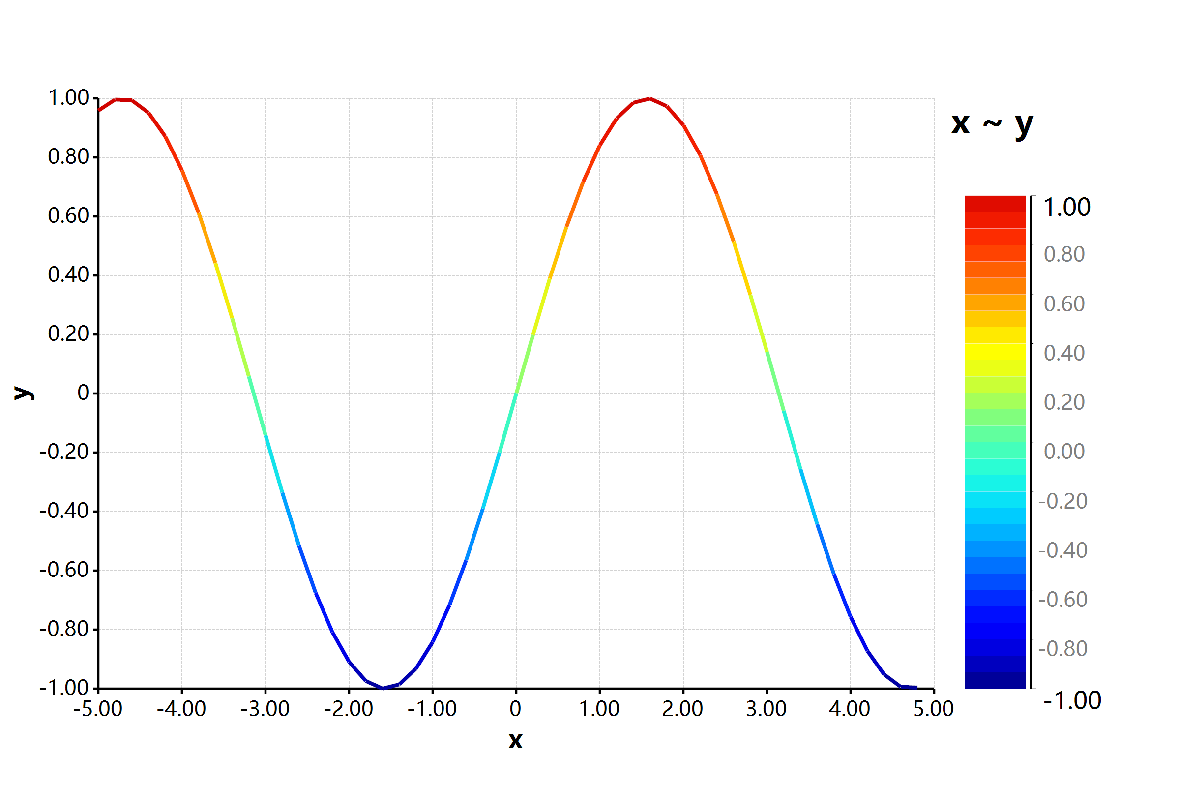
x     = seq(-5, 5, by = 0.2)
y     = sin(x)
input = data.frame(x = x, y = y)

def plotfile(filepath):
   print("previews of the plot table:")
   print(input, max.print = 13)

   plt = ggplot(input, aes(x = "x", y = "y"), padding = "padding: 200px 500px 200px 200px;", width = 2400, height = 1600)
   plt = plt + geom_line(width = 8, show.legend = TRUE, color = "Jet")

   bitmap(plt, file = filepath)

plotfile(`${@dir}/line_sin_py.png`)

# --=== Create Elegant Data Visualisations Using the Grammar of Graphics ===--
#  *                                                                          *
#  * ggplot is an open-source data visualization                              *
#  * package for the statistical programming                                  *
#  * language R#.                                                             *
#  *                                                                          *
#  ----=====   R# author: xieguigang <xie.guigang@gcmodeller.org>    ======----

# github: https://github.com/rsharp-lang/ggplot

# [1] "previews of the plot table:"
#               x          y
# ---------------------------
# <mode> <double>   <double>
# [1, ]        -5   0.958924
# [2, ]      -4.8   0.996165
# [3, ]      -4.6   0.993691
# [4, ]      -4.4   0.951602
# [5, ]      -4.2   0.871576
# [6, ]        -4   0.756802
# [7, ]      -3.8   0.611858
# [8, ]      -3.6    0.44252
# [9, ]      -3.4   0.255541
# [10, ]     -3.2  0.0583741
# [11, ]       -3   -0.14112
# [12, ]     -2.8  -0.334988
# [13, ]     -2.6  -0.515501

#  [ reached 'max' / getOption("max.print") -- omitted 37 rows ]
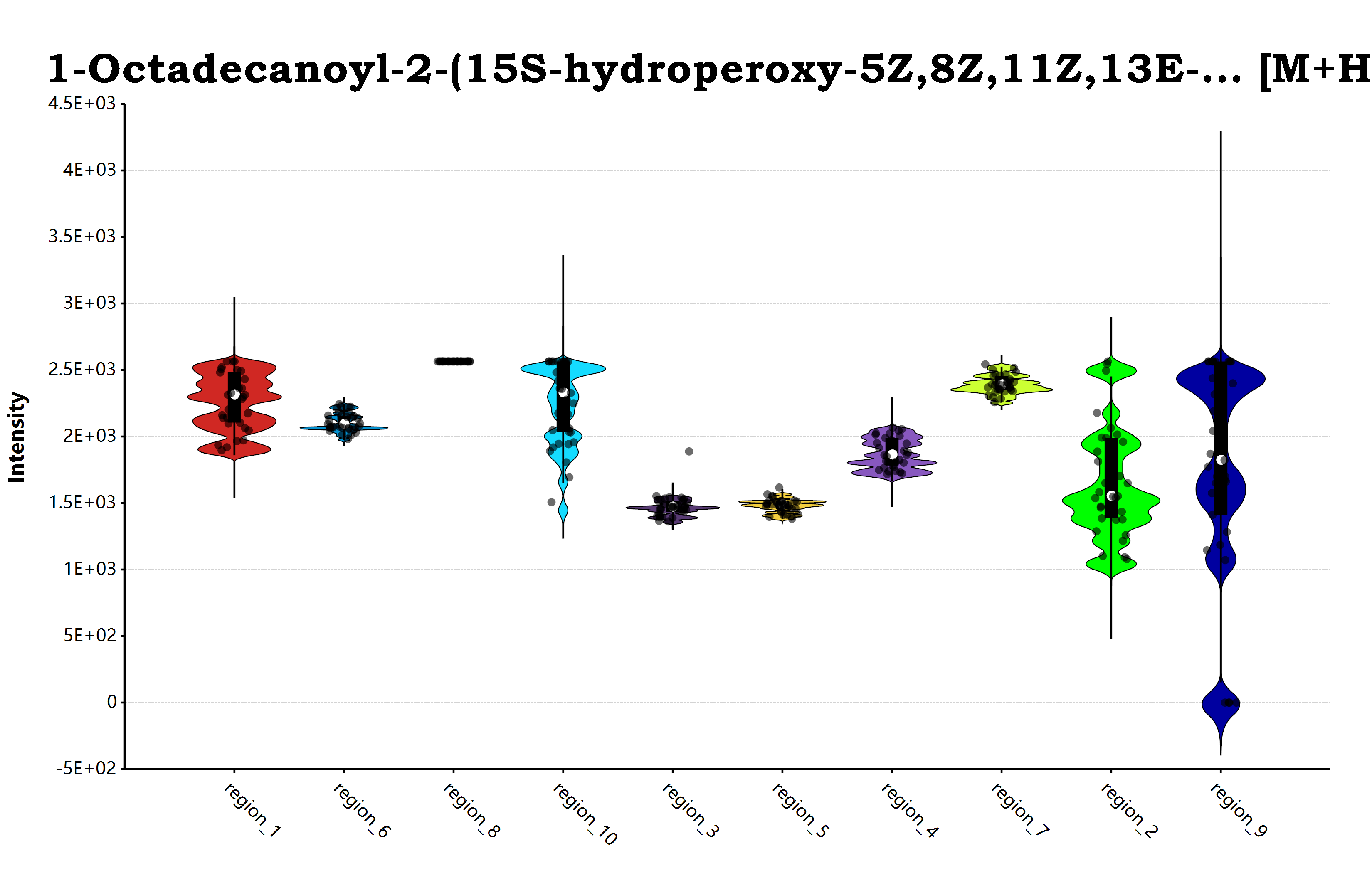
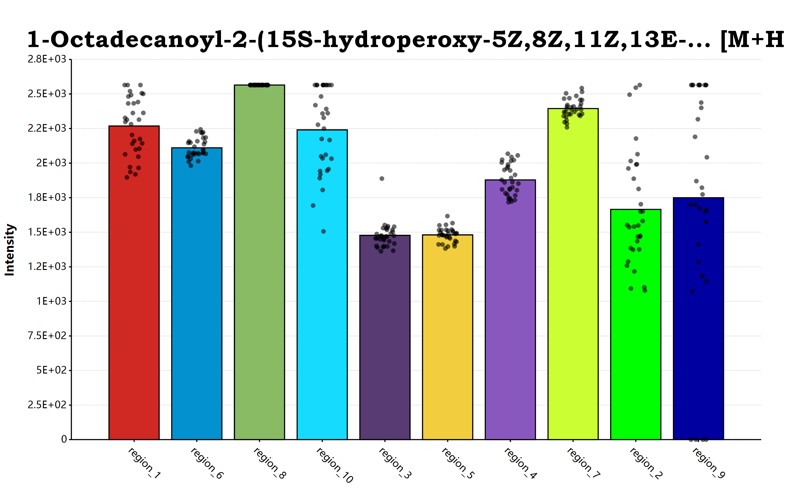
ggplot(groups, aes(x = "tags", y = "data", color = "colors"), padding = "padding: 250px 100px 250px 300px;")
+ geom_violin(width = 1)
+ geom_jitter(width = 0.3)
+ ggtitle(name)
+ ylab("Intensity")
+ xlab("")
+ scale_y_continuous(labels = "G2")
+ theme(axis.text.x = element_text(angle = 45))
;
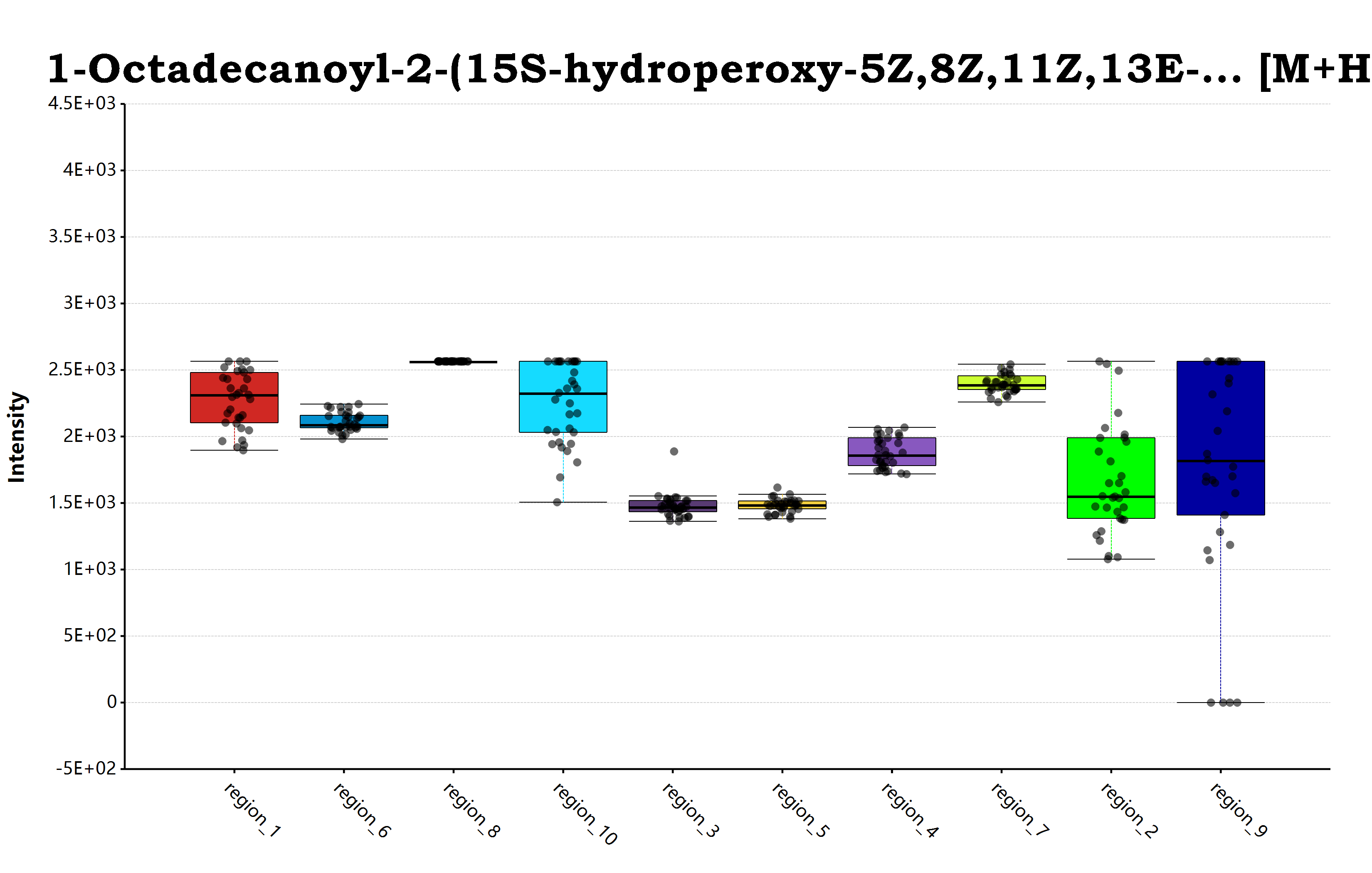
ggplot(groups, aes(x = "tags", y = "data", color = "colors"), padding = "padding: 250px 100px 250px 300px;")
+ geom_boxplot(width = 0.8)
+ geom_jitter(width = 0.3)
+ ggtitle(name)
+ ylab("Intensity")
+ xlab("")
+ scale_y_continuous(labels = "G2")
+ theme(axis.text.x = element_text(angle = 45))
;
ggplot(groups, aes(x = "tags", y = "data", color = "colors"), padding = "padding: 250px 100px 250px 300px;")
+ geom_barplot(width = 0.8)
+ geom_jitter(width = 0.3)
+ ggtitle(name)
+ ylab("Intensity")
+ xlab("")
+ scale_y_continuous(labels = "G2")
+ theme(axis.text.x = element_text(angle = 45))
;
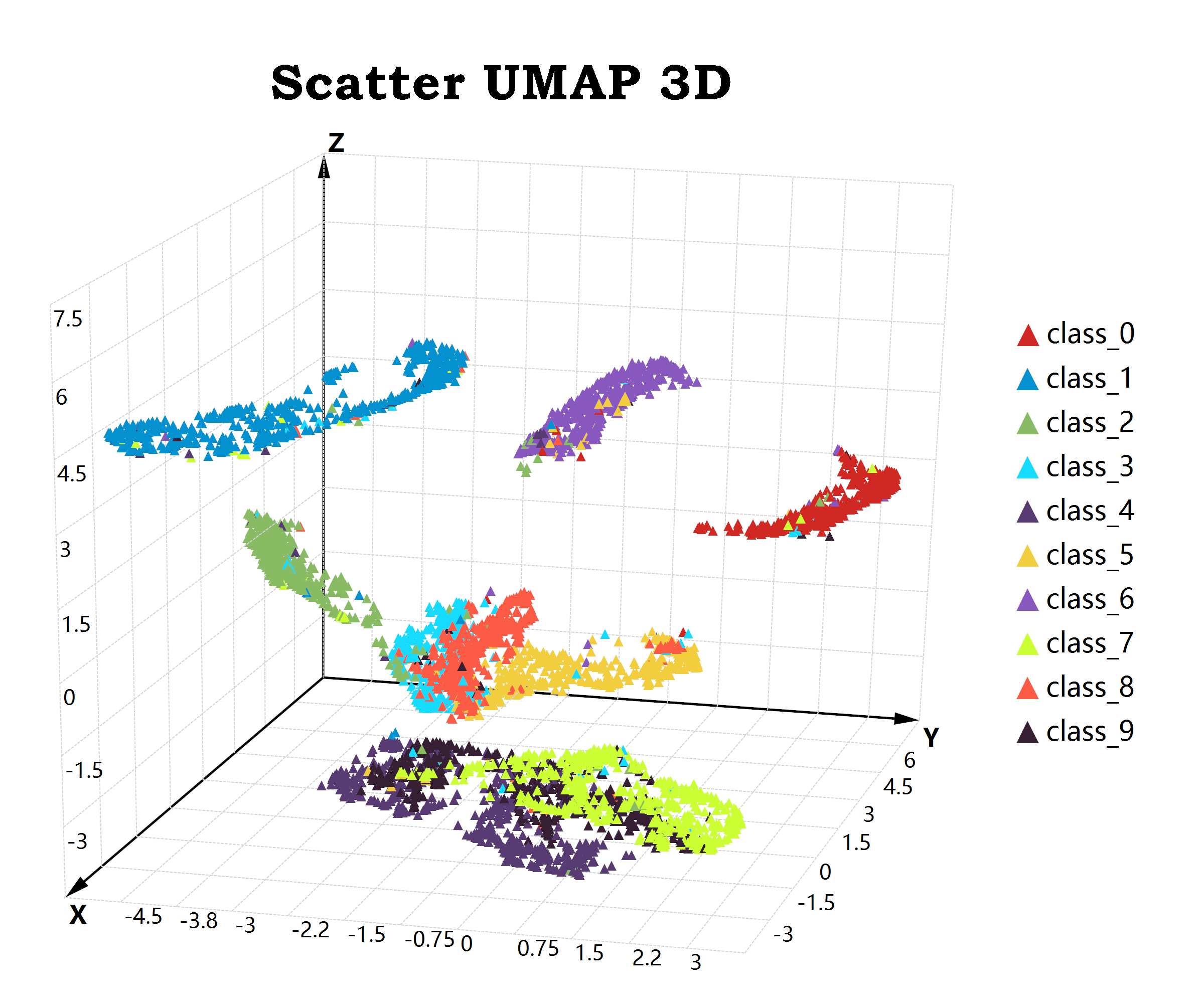
Plot 3d scatter
rendering a 3d chart in ggplot package is just simply enough as create a 2d chart plot. we just needs add a data mapping of the z axis at here!
# create ggplot layers and tweaks via ggplot style options
ggplot(data, aes(x = "X", y = "Y", z = "Z"), padding = "padding:250px 500px 100px 100px;")

   # use scatter points for visual our data
   + geom_point(aes(color = "class"), color = "paper", shape = "triangle", size = 20)
   + ggtitle("Scatter UMAP 3D")
   # use the default white theme from ggplot
   + theme_default()

   # use a 3d camera to rotate the charting plot
   # and adjust view distance
   + view_camera(angle = [31.5,65,125], fov = 100000)
   ;
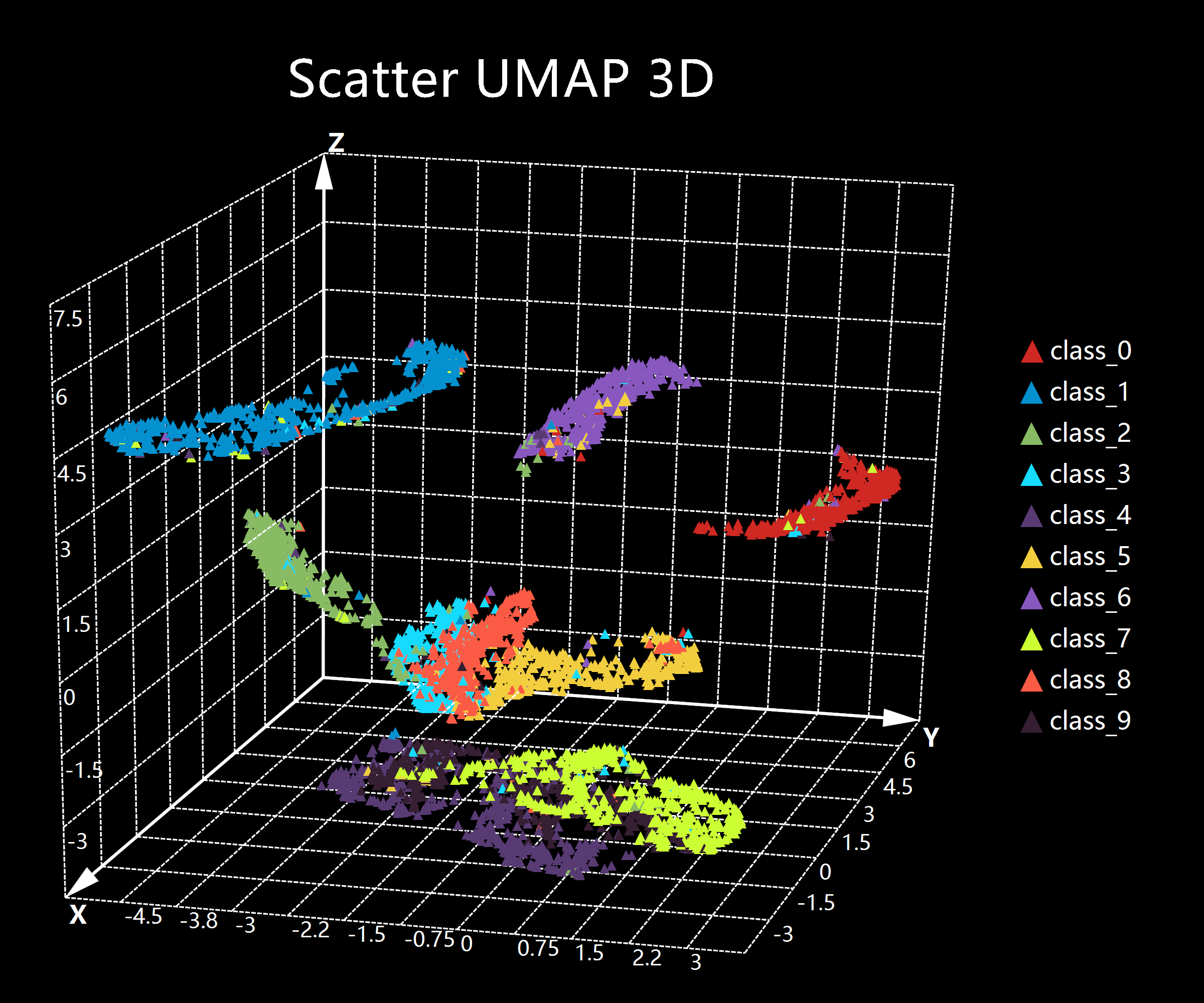
Theme in ggplot
just change the function theme_default to theme_black, then we can get a cool 3d scatter plot in black theme:
ggplot(data, aes(x = "X", y = "Y", z = "Z"), padding = "padding:250px 500px 100px 100px;")

   + geom_point(aes(color = "class"), color = "paper", shape = "triangle", size = 20)
   + ggtitle("Scatter UMAP 3D")
   # use the black theme from ggplot package
   + theme_black()
   + view_camera(angle = [31.5,65,125], fov = 100000)
   ;
Vignettes
- read the online help document.
- blog article about ggplot implements: https://stack.xieguigang.me/2021/implements-ggplot-package-for-rsharp-language/